Clay Helberg, M.S.
Research Design and Statistics Unit
University of Wisconsin Schools of Nursing and Medicine
600 Highland Ave. K6/380
Madison, WI 53792
NOTE: The author has moved to SPSS, Inc., and can be reached at the following address:
Clay Helberg
SPSS, Inc.
233 S. Wacker Drive, 11th Floor
Chicago, IL 60606
email: chelberg@spss.com
This paper presents material covered in a workshop at the Third International Applied Statistics in Industry Conference in Dallas, TX, June 5-7, 1995. The hypertext version of the workshop is available on the World-Wide Web (WWW) at the following location:
http://www.execpc.com/~helberg/pitfalls/
It may be helpful to consider some aspects of statistical thought which might lead many people to be distrustful of it. First of all, statistics requires the ability to consider things from a probabilistic perspective, employing quantitative technical concepts such as "confidence", "reliability", "significance". This is in contrast to the way non-mathematicians often cast problems: logical, concrete, often dichotomous conceptualizations are the norm: right or wrong, large or small, this or that.
Additionally, many non-mathematicians hold quantitative data in a sort of awe. They have been lead to believe that numbers are, or at least should be, unquestionably correct. Consider the sort of math problems people are exposed to in secondary school, and even in introductory college math courses: there is a clearly defined method for finding the answer, and that answer is the only acceptable one. It comes, then, as a shock that different research studies can produce very different, often contradictory results. If the statistical methods used are really supposed to represent reality, how can it be that different studies produce different results? In order to resolve this paradox, many naive observers conclude that statistics must not really provide reliable (in the nontechnical sense) indicators of reality after all. And, the logic goes, if statistics aren't "right", they must be "wrong". It is easy to see how even intelligent, well-educated people can become cynical if they don't understand the subtleties of statistical reasoning and analysis.
Now, I'm not going to say much about this "public relations crisis" directly, but it does provide a motivation for examining the way we practice our trade. The best thing we can do, in the long run, is make sure we're using our tools properly, and that our conclusions are warranted. I will present some of the most frequent misuses and abuses of statistical methods, and how to avoid or remedy them. Of course, these issues will be familiar to most statisticians; however, they are the sorts of things that can get easily overlooked when the pressure is on to produce results and meet deadlines. If this workshop helps you to apply the basics of statistical reasoning to improve the quality of your product, it will have served its purpose.
We can consider three broad classes of statistical pitfalls. The first involves sources of bias. These are conditions or circumstances which affect the external validity of statistical results. The second category is errors in methodology, which can lead to inaccurate or invalid results. The third class of problems concerns interpretation of results, or how statistical results are applied (or misapplied) to real world issues.
Representative sampling. This is one of the most fundamental tenets of inferential statistics: the observed sample must be representative of the target population in order for inferences to be valid. Of course, the problem comes in applying this principle to real situations. The ideal scenario would be where the sample is chosen by selecting members of the population at random, with each member having an equal probability of being selected for the sample. Barring this, one usually tries to be sure that the sample "parallels" the population with respect to certain key characteristics which are thought to be important to the investigation at hand, as with a stratified sampling procedure.
While this may be feasible for certain manufacturing processes, it is much more problematic for studying people. For instance, consider the construction of a job applicant screening instrument: the population about which you want to know something is the pool of all possible job applicants. You surely won't have access to the entire population--you only have access to a certain number of applicants who apply within a certain period of time. So you must hope that the group you happen to pick isn't somehow different from the target population. An example of a problematic sample would be if the instrument were developed during an economic recession; it is reasonable to assume that people applying for jobs during a recession might be different as a group from those applying during a period of economic growth (even if one can't specify exactly what those differences might be). In this case, you'd want to exercise caution when using the instrument during better economic times.
There are also ways to account for, or "control", differences between groups statistically, as with the inclusion of covariates in a linear model. Unfortunately, as Levin (1985) points out, there are problems with this approach, too. One can never be sure one has accounted for all the important variables, and inclusion of such controls depends on certain assumptions which may or may not be satisfied in a given situation (see below for more on assumptions).
Statistical assumptions. The validity of a statistical procedure depends on certain assumptions it makes about various aspects of the problem. For instance, well-known linear methods such as analysis of variance (ANOVA) depends on the assumption of normality and independence. The first of these is probably the lesser concern, since there is evidence that the most common ANOVA designs are relatively insensitive to moderate violations of the normality assumption (see Kirk, 1982). Unfortunately, this offers an almost irresistible temptation to ignore any non-normality, no matter how bad the situation is. The robustness of statistical techniques only goes so far--"robustness" is not a license to ignore the assumption. If the distributions are non-normal, try to figure out why; if it's due to a measurement artifact (e.g. a floor or ceiling effect), try to develop a better measurement device (if possible). Another possible method for dealing with unusual distributions is to apply a transformation. However, this has dangers as well; an ill-considered transformation can do more harm than good in terms of interpretability of results.
The assumption regarding independence of observations is more troublesome, both because it underlies nearly all of the most commonly used statistical procedures, and because it is so frequently violated in practice. Observations which are linked in some way--parts manufactured on the same machine, students in the same classroom, consumers at the same mall--all may show some dependencies. Therefore, if you apply some statistical test across students in different classrooms, say to assess the relationship between different textbook types and test scores, you're introducing bias into your results. This occurs because, in our example, the kids in the class presumably interact with each other, chat, talk about the new books they're using, and so influence each other's responses to the test. This will cause the results of your statistical test (e.g. correlations or p-values) to be inaccurate.
One way to try to get around this is to aggregate cases to the higher level, e.g. use classrooms as the unit of analysis, rather than students. Unfortunately this requires sacrificing a lot of statistical power, making a Type II error more likely. Happily, methods have been developed recently which allow simultaneous modeling of data which is hierarchically organized (as in our example with students nested within classrooms). One of the papers presented at this conference (Christiansen & Morris) introduces these methods. Additionally, interested readers are referred to Bryk & Raudenbush (1988) and Goldstein (1987) for good overviews of these hierarchical models.
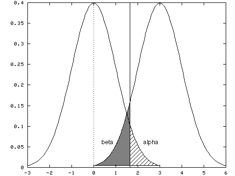
Statistical Power. This topic has become quite in vogue lately, at least in the academic community; indeed, some federal funding agencies seem to consider any research proposal incomplete unless it contains a comprehensive power analysis. This graph will help illustrate the concept of power in an experiment. In the figure, the vertical dotted line represents the point-null hypothesis, and the solid vertical line represents a criterion of significance, i.e. the point at which you claim a difference is significant.
Now, if you have too little power, you run the risk of overlooking the effect you're trying to find. This is especially important if you intend to make inferences based on a finding of no difference. This is what allows advertisers to claim "No brand is better at relieving headaches (or what have you)"--if they use a relatively small sample (say 10 people), of course any differences in pain relief won't be significant. The differences may be there, but the test used to look for them was not sensitive enough to find them.
While the main emphasis in the development of power analysis has been to provide methods for assessing and increasing power (see, e.g. Cohen, 1991), it should also be noted that it is possible to have too much power. If your sample is too large, nearly any difference, no matter how small or meaningless from a practical standpoint, will be "statistically significant". This can be particularly problematic in applied settings, where courses of action are determined by statistical results. (I'll have more to say about this later.)
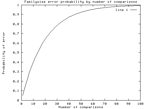
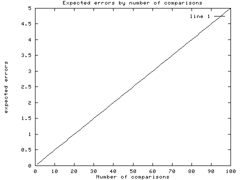
Multiple comparisons. This is a particularly thorny issue, because often what we want to know about is complex in nature, and we really need to check a lot of different combinations of factors to see what's going on. However, doing so in a haphazard manner can be dangerous, if not downright disastrous. Remember that each comparison we make (assuming we're using the standard hypothesis testing model) entails a Type I error risk equal to our predefined alpha. We might assign the conventional value of .05 to alpha. Each comparison we make has a (1 - .05) = .95 probability of avoiding a Type I error.
Now suppose we have 12 process variables, and we want to see what the relationships are among them. We might be tempted to calculate the 66 possible correlations, and see which ones turn out to be statistically significant. Here's where the fun begins: in the best-case scenario, where the comparisons are independent (not true for this example, but we'll assume it for the sake of argument), the probability of getting all the comparisons right is the product of the probabilities for getting each comparison right. In this case that would be (.95)^66, or about .03. Thus your chance of getting all 66 comparisons right is almost zero. This figure shows the probability of getting one or more errors based on how many comparisons you make, assuming a per-comparison alpha of .05.
Measurement error. Most statistical models assume error free measurement, at least of independent (predictor) variables. However, as we all know, measurements are seldom if ever perfect. Particularly when dealing with noisy data such as questionnaire responses or processes which are difficult to measure precisely, we need to pay close attention to the effects of measurement errors. Two characteristics of measurement which are particularly important in psychological measurement are reliability and validity.
Reliability refers to the ability of a measurement instrument to measure the same thing each time it is used. So, for instance, a reliable measure should give you similar results if the units (people, processes, etc.) being measured are similar. Additionally, if the characteristic being measured is stable over time, repeated measurement of the same unit should yield consistent results.
Validity is the extent to which the indicator measures the thing it was designed to measure. Thus, while IQ tests will have high reliability (in that people tend to achieve consistent scores across time), they might have low validity with respect to job performance (depending on the job). Validity is usually measured in relation to some external criterion, e.g. results on a job-applicant questionnaire might be compared with subsequent employee reviews to provide evidence of validity.
Methods are available for taking measurement error into account in some statistical models. In particular, structural equation modeling allows one to specify relationships between "indicators", or measurement tools, and the underlying latent variables being measured, in the context of a linear path model. For more information on structural equation modeling and its uses, see Bollen (1989).
Confusion over significance. While this topic has been expounded upon by nearly every introductory statistics textbook, the difference between "significance" in the statistical sense and "significance" in the practical sense continues to elude many statistical dabblers and consumers of statistical results. There is still a strong tendency for people to equate stars in tables with importance of results. "Oh, the p-value was less than .001--that's a really big effect," we hear our clients say. Well, as I pointed out earlier, significance (in the statistical sense) is really as much a function of sample size and experimental design as it is a function of strength of relationship. With low power, you may be overlooking a really useful relationship; with excessive power, you may be finding microscopic effects with no real practical value. A reasonable way to handle this sort of thing is to cast results in terms of effect sizes (see Cohen, 1994)--that way the size of the effect is presented in terms that make quantitative sense. Remember that a p-value merely indicates the probability of a particular set of data being generated by the null model--it has little to say about size of a deviation from that model (especially in the tails of the distribution, where large changes in effect size cause only small changes in p-values).
Precision and Accuracy. These are two concepts which seem to get confused an awful lot, particularly by those who aren't mathematically inclined. It's a subtle but important distinction: precision refers to how finely an estimate is specified (akin to number of decimal places given, e.g. 4.0356 is more precise than 4.0), whereas accuracy refers to how close an estimate is to the true value. Estimates can be precise without being accurate, a fact often glossed over when interpreting computer output containing results specified to the fourth or sixth or eighth decimal place. My advice: don't report any more decimal places than you're fairly confident are reflecting something meaningful. Thus, if your standard error of a mean is 1.2, there's no sense in reporting the third or fourth decimal place of the estimated mean--it will only lull the unwary into a false sense of security.
Causality. I don't think anything has caused as much mischief in research and applied statistics as unclear thinking about causality. Assessing causality is the raison d'être of most statistical analysis, yet its subtleties escape many statistical consumers.
The bottom line on causal inference is this: you must have random assignment. That is, the experimenter must be the one assigning values of predictor variables to cases. If the values are not assigned or manipulated, the most you can hope for is to show evidence of a relationship of some kind. Observational studies are very limited in their ability to illuminate causal relationships. Take, for example, an hypothesized relationship between number of health-care visits and socioeconomic status (SES), i.e. the higher your SES, the more you visit the clinic. There are three possible explanations for this: one is that people with high SES have the means to pay for frequent clinic visits (SES -> visits); another is that people who visit their doctor frequently are in better health and so are able to be more productive at work, get better jobs, etc. (visits -> SES); the third is that something else (e.g. size of city) affects both clinic visitation and SES independently (larger cities have more clinics and offer better paying jobs), making them go up and down together (visits <- X -> SES).
I want to point out here that this factor of causal inference (i.e. random assignment) is the key regardless of the statistical methodology used. We've all had it drummed into our heads that "correlation is not causation". Unfortunately, some people seem to interpret that as implying that correlation (and regression) can't be used for causal analysis; or worse, that experimentally oriented statistical designs (e.g. ANOVA) are necessary and sufficient conditions for causal inference. Neither of these interpretations is correct; if you assign values to a predictor variable (e.g. by manipulating drug dosages), it is perfectly legitimate to use a correlation coefficient or a regression equation to generate inferences about the effectiveness of the drug. Conversely, if you're measuring relationships between political affiliation and self-esteem, it doesn't matter what sort of elaborate ANOVA design you put together--you still won't have a warrant for making causal statements about what causes what, since you aren't assigning people to political parties.
Now, of course, many of the things we might wish to study are not subject to experimental manipulation (e.g. health problems/risk factors). If we want to understand them in a causal framework, we must be very cautious. It will require a multifaceted approach to the research (you might think of it as "conceptual triangulation"), use of chronologically structured designs (placing variables in the roles of antecedents and consequents), and plenty of replication, to come to any strong conclusions regarding causality.
Graphical Represenations. There are many ways to present quantitative results numerically, and it is easy to go astray (or to lead your audience astray, if you are less than scrupulous) by misapplying graphical techniques. Tufte's book, The Visual Display of Quantitative Information, gives a wealth of information and examples on how to construct good graphs, and how to recognize bad ones. I'll present a few of these examples here.
One of the principles Tufte introduces to indicate the relationship between the data and the graphic is a number he calls "the Lie Factor". This is simply the ratio of the difference in the proportion of the graphic elements versus the difference in the quantities they represent. The most informative graphics are those with a Lie Factor of 1. Here is an example of a badly scaled graphic, with a lie factor of 14.8:

(from Tufte, 1983, p. 57)
Another key element in making informative graphs is to avoid confounding design variation with data variation. This means that changes in the scale of the graphic should always correspond to changes in the data being represented. Here is an example which violates this principle:

(from Tufte, 1983, p. 61)
Notice that from 1973-1978, each bar in the graph represents one year, whereas for 1979 each bar represents only one quarter. Also notice that the vertical scale changes between '73-'78 and the four quarters of '79. It is very difficult to determine from this graph what the real trend is due to the confusion between the design variation and data variation.
Another trouble spot with graphs is multidimensional variation. This occurs where two-dimensional figures are used to represent one-dimensional values. What often happens is that the size of the graphic is scaled both horizontally and vertically according to the value being graphed. However, this results in the area of the graphic varying with the square of the underlying data, causing the eye to read an exaggerated effect in the graph. An example:
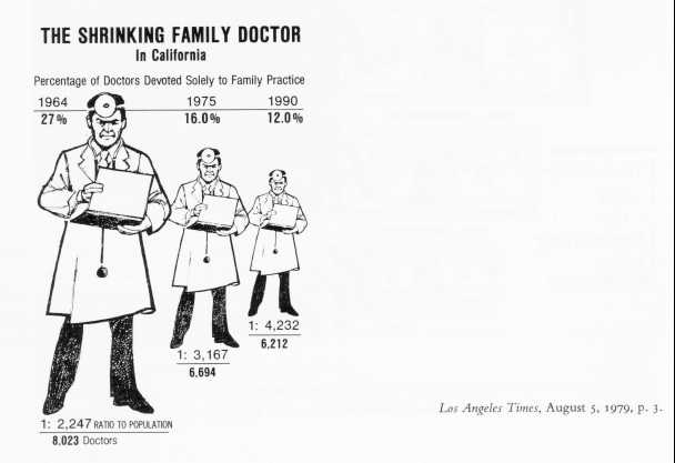 (from Tufte, 1983, p. 69)
This graph has a lie factor of about 2.8, based on the variation between the area of each doctor graphic and the number it represents.
And, one more point about graphs: be sure to include enough context to make the graph meaningful. For instance, one may be tempted to draw unwarranted conclusions based on this graph:
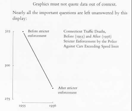 (from Tufte, 1983, p. 74)
However, if one looks at the data in context, the pattern becomes less
cut-and-dried:
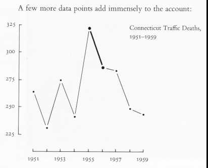 (from Tufte, 1983, p. 74)
Clearly, there are other forces at work on the traffic situation besides the stricter enforcement. This information would be completely missed if all you had to look at was the former graph.
Bryk, A.S. & Raudenbush, S.W. (1992). Hierarchical Linear Models. Newbury Park: Sage Publications.
Cohen, J. (1988). Statistical Power Analysis for the Behavioral Sciences. Hillsdale, NJ: Lawrence Erlbaum Associates.
Cohen, J. (1990). Things I have learned (so far). American Psychologist, 45, 1304-1312.
Goldstein, H.I. (1987) Multilevel Models in Educational and Social Research. London: Oxford University Press.
Kirk, R. (1982). Experimental Design: Procedures for the Behavioral Sciences. Monterrey, CA: Brooks/Cole.
Levin, J.R. (1985). Some methodological and statistical "bugs" in research on children's learning. In M. Pressley & C.J. Brainerd (Eds.), Cognitive Learning and Memory in Children. New York: Springer-Verlag.
Tufte, E.R. (1983). The Visual Display of Quantitative Information. Cheshire, CT: Graphics Press.
Cohen, J. (1994). The earth is round (p < .05). American Psychologist, 49, 997-1003.
Huff, Darrrell. (1954). How to Lie with Statistics. New York: W.W. Norton & Company.
King, G. (1986). How not to lie with statistics: Avoiding common mistakes in quantitative political science. American Journal of Political Science, 30 666-687.
Levin, J.R. & Levin, M.E. (1993). Methodological problems in research on academic retention programs for at-risk minority college students. Journal of College Student Development, 34, 118-124.
Nester, M.R. (1996). An Applied Statistician's Creed. Applied Statistics, 45, 401-410.
Paulos, J.A. (1988). Innumeracy: mathematical illiteracy and its consequences. New York: Hill & Wang.